You guessed it: I’m still not a doctor. And, if I’m being honest, I never wanted to be one. Ever. The hours, the stress, the mental fatigue. I couldn’t do it.
Oh sure, I’ll go chase a two mile-wide tornado with 300mph wind in Oklahoma. But try to give a kid his booster shot? Nah.
Anyway. Here is a look at the latest numbers for Mississippi, with some context, as well as some new research…
New Numbers
Here is an image of the daily counts for July.
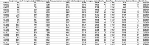
The estimates are based on past studies. I’ve written about those studies extensively. As a reminder the estimates are just that: Estimates. They are not exact, nor should they be treated as such. Jut a good ‘ballpark’ idea on the numbers given what past research has hypothesized.
It is also worth noting that the numbers of cases and deaths related to COVID-19 continue to rise.

As you can see from the above chart, the two weeks following some recent major events in Mississippi have resulted in large increases in COVID-19 cases. And while it isn’t prudent to look at one singular event as a catalyst for increased numbers, it is important to look at all events as individual pieces of the puzzle that have – sadly – resulted in a recent large increase in the number of cases reported per day.
As little as six weeks ago, Mississippi was averaging 289 cases per day. That number has now ballooned up to 1162.
There is some good news. The death rate continues to diminish. In May, when COVID-19 was at its ‘deadliest’ per case, the rate was 6.13-percent. It is now down to 1.53-percent.
And while, yes, that is an improvement. It also means one to two people die, for every 100 that is infected.

The above chart is a good visual representation of cases and deaths. Cases are on the left axis, deaths are on the right axis. The marks correspond to each two-week period. Both are, sadly, rising. The past two weeks was the deadliest two weeks in Mississippi since the pandemic started back in March.
COVID-19 & Weather
So, for those of you who have offered a friendly reminder to me to “Stick to weather” I wanted to highlight this interesting paper: “COVID‐19 Pandemic Imperils Weather Forecast.”
The author tries to make the connection between the reduction in the number of aircraft in the skies, and the reduction of useful data being injected into the model data from those planes. The result is less accurate model data, and thus poorly skill from forecasters.
The study reports:
We see deterioration in the forecasts of surface meteorology and atmospheric stratification, and larger deterioration in longer‐term forecasts. This could handicap early warning of extreme weather and cause additional economic damage on the top of that from the pandemic itself. The impacts over Western Europe are small due to the high density of conventional observations, suggesting that introduction of new observations would be needed to minimize the impact of global emergencies on weather forecasts in future.
Anecdotally, I would agree with this paper. I know that during the severe weather in April, the model data really struggled at times to produce worthwhile data. And so far this Hurricane Season, the model data has been relatively suspect at times, too.
But feelings aren’t facts. So let’s dive into the findings…

Since this actually has to do with my area of study, I would argue that comparing the data sets from 2017 to 2020 aren’t equal. The models are continually improved and changed over time to correct for biases. It isn’t comparing apples to oranges, but maybe like McIntosh apples to Gala apples.
While I do think this study carries weight and has merit, further study will be needed to figure out just how much – if any – forecasts were actually affected. Running a comparison with the WRF model may produce better results, though it would be for a much short timescale.
Teens pass along COVID to family member nearly 20-percent of the time
Int he study, “Contact Tracing during Coronavirus Disease Outbreak, South Korea, 2020” the authors tried to quantify how people were passing COVID-19 along to others. In particular how people pass COVID-19 along to others within their own home.
This paper was spread pretty quickly across social media last week and the week before.
Looking back through the data, it showed that for their sample size, if a teen got it, and brought it home, 20-percent of the time there was someone in the house who also got sick. For kids nine and younger it was only five percent. Small sample size, but still. That is a pretty low percentage by comparison. Especially when considering that the regular flu is often spread by kids the most.
From the study:
“We also found the highest COVID-19 rate (18.6% [95% CI 14.0%–24.0%]) for household contacts of school-aged children and the lowest (5.3% [95% CI 1.3%–13.7%]) for household contacts of children 0–9 years in the middle of school closure. Despite closure of their schools, these children might have interacted with each other, although we do not have data to support that hypothesis.
A contact survey in Wuhan and Shanghai, China, showed that school closure and social distancing significantly reduced the rate of COVID-19 among contacts of school-aged children (8). In the case of seasonal influenza epidemics, the highest secondary attack rate occurs among young children (9).
Children who attend day care or school also are at high risk for transmitting respiratory viruses to household members (10). The low detection rate for household contacts of preschool-aged children in South Korea might be attributable to social distancing during these periods. Yet, a recent report from Shenzhen, China, showed that the proportion of infected children increased during the outbreak from 2% to 13%, suggesting the importance of school closure (11).
Further evidence, including serologic studies, is needed to evaluate the public health benefit of school closure as part of mitigation strategies.”

The authors noted that the study did have limitations. The number of cases might have been underestimated because all asymptomatic patients might not have been identified, plus it is unknown if a detected cases could have resulted from exposure outside the household. The authors also noted that given the different thresholds for testing policy between households and nonhousehold contacts, they could not assess the true difference in transmissibility between households and nonhouseholds.
Despite the limitations, they claim the sample size was large and representative of most COVID-19 patients early during the outbreak in South Korea.
So let’s just into a bubble. And play some make-believe to wrap out heads around this.
The paper shows that if kids under 10 do get the virus, a secondary infection within a household occurred – roughly – five out of every 100 times. Or, lets say there is a made-up school where every family is a family of five. So the kid in class with four other people in the house. That gives us a good round number of 100 people per classroom, not counting the kids in that classroom.
That means, the math from the paper suggests that five kids out of every 25 families will have a child – between 0-9 years old – pass it along to another member of the household. Could be three kids from the same family and two from another. Or it could be five separate kids from five separate families. But it the paper suggests five kids.
That doesn’t sound too terrible. But we will re-visit that in a second.
In that same made-up scenario, for teens, that number more than triples. But it has more interesting consequences. It suggests that up to 19 out of every 25 families will have a child – between 10-19 years old – pass it along to another member of the household.
That is staggering.
Nick, what kind of math is that? 19-percent is not 19 out of 25
You’re right! But the research showed that for every 100 people tested in the houses, teens were responsible for passing the virus on to 19 of those people.
And in our bubble, everyone has four other family members. And there are 25 kids in the class. 25 kids x 4 family members = 100 total people.
Of those 100 people, in 25 different families, 19 are COVID-19-positive from teens.
But again, we are in a make-believe bubble.
We did this for easy math. So this isn’t really applicable to real-life.
I mean, how many schools have classrooms with every kid in a five-person family? None that I’ve ever seen.
Why else doesn’t this work?
The numbers for this paper were taken during isolation and quarantine, not during school. So, in reality, the numbers cannot be applied to school since most of these kids were at home during this time, and not at school.
So it is important to be transparent about what we know and what we don’t know. And how examples aren’t realistic, but rather just being used for easy math.
Could it be worse than the research shows? Totally. We all know kids. They aren’t the best at keeping clean. I know I wasn’t.
Could it be not as bad? Totally. Perhaps not being cooped up with family would help distance them from others and reduce long-term close-contact.
But, again, we have to be transparent about what we don’t know. And we don’t know. Because we don’t have any evidence to highlight either side. If any one wants to make a point that Kids will be safer at school or in more danger at school, it is mostly conjecture.
The most reliable information we have to date suggests that once kids do get the virus, though, that they can spread it to others in the house. And kids are equally as likely to be infected, they just may not be symptomatic like older people. And symptomatic versus asymptomatic does not dictate how much a person is able to spread the virus.
So, even if it is as low as five kids infecting others in five families across a single grade with multiple classes, that could have some pretty scary consequences.
This is why schools are really weighing their options.
And why – as parents – you should, too. Talk to your schools and school districts. Let them know how you feel. If you are fine with in-person classes, great, let them know. If you’re not, great. Let them know.
Smart Watches to the rescue
In a paper titled, “Early Detection Of COVID-19 Using A Smartwatch” the authors looked at a small sample-size of people who use Smart Watches and were able to obtain an early warning that they were infected with COVID-19.
The authors wrote:
Using Fitbit data from enrolled participants (n = 24) with self-reported COVID-19 diagnoses and complete physiological markers (from 14 days prior to symptom onset to at least 7 days after), COVID-19 diagnosis was associated with increased heart rate (median: 7 beats/minute increase) 3-7 days before symptom onset. Decreases in daily steps and increased sleep duration were observed primarily in pre-symptomatic periods but following onset of resting heart rate signals associated with COVID-19 illness.
There was high variability between individuals’ physiological markers and the progression/severity of COVID-19 illness. Based on these findings, investigators developed an algorithm detecting abnormal resting heart rates associated with pre-symptomatic COVID-19 infection. The algorithm detected 67% of COVID-19 cases prior to symptom onset in 24 participants supplying 28 days of physiological data ahead of symptom onset.
And while 67-percent may not sound like a “good” number, it is actually reasonably useful. For example, the Karrie Meter was only 70-percent successful on the first trial run. After sI put in some work on the algorithm, it got better. So this may just be a start for the authors.
The paper was actually features on the Johns Hopkins site. And the doctors there even offered their own take on the paper:
“Physiological data derived from wearable technology in 24 US COVID-19 patients revealed latent physiological disturbance patterns—including heightened heart rate, decreased physical activity, and increased sleep duration—prior to symptom onset. A wearable technology detection algorithm correctly identified physiological abnormalities associated with pre-symptomatic COVID-19 infection in two-thirds of COVID-19 patients prior to symptom onset.”
I know a handful of people who use a Smart Watch. I don’t think I’ll ever get one, but I can see the utility. Especially now. So if you do have one, keep track of your heart, your sleep, and your movement. It may be telling you something, according to this research.


