As Hurricane Season continues, it is important to know how to read the maps from the National Hurricane Center as they monitor certain areas for development. Each time there is an ‘area of interest’ in the Tropics, I hear from a lot of folks asking about the forecast.
So I wanted to take some time to clear up any confusion you may have about how to read the maps the National Hurricane Center (NHC) uses when they are monitoring an area for development.
The Map
Here is a look at the map the NHC uses. They issues these maps for two- and five-day forecasts. You can also find these maps here! These outlooks give you a general idea about where tropical systems are located currently and where potential tropical systems may develop during the next two and five days. These maps also give a probability (percent-chance) of development
Yellow is used to indicate a “low” chance.
Orange is used for a “medium” chance of development.
Red is shown for a “high” chance of development.
Aseas highlighted with an “X” are often referred to, on this site, as an “area of interest” as it is the place where the NHC is focusing their attention. Once the NHC decides the area is worth extra investigation, they will tag it as an “Invest” and give it a number between 90 and 99. For example, “Invest 91L” may be what one of these areas is called. The “L” indicates the ocean basin. The atLantic, in this case.
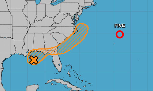
The “X” mark, specifically, is where the NHC thinks the current center of the “area of interest” is located. The hatched circled area indicates where the NHC thinks there will be development during the next two or five days.
At times, there will be an arrow on the map, too. The arrow indicates what direction the center of the “area of interest” will be moving during the next few days.

And it is important to note that the chance of development doesn’t indicate the intensity of the potential storm. All the NHC is indicating is the percent-chance that whatever is out there turns into a Tropical Depression.
In some cases, like the map above, the area of potential development is in a different place than where the wave / low pressure center is currently. For situations like that, they put an “X” where the area of low pressure or wave is currently located. Then they point an arrow from the “X” to the area where development is possible.
Hopefully this quick explainer is helpful during hurricane season as you continue to monitor trends in the tropics!


