If you’ve been following along, I post reviews of scientific articles on Tuesday’s and Friday’s so take a look at what I found in reading, “Visualizing Multiple Measures of Forecast Quality by Paul J. Roebber from the University of Wisconsin. Enjoy!
Overview:
As the modern technology of today continues to grow, people are always seeking to have the most accurate information and of course, that puts a higher pressure on forecasters. Roebber takes a look into how we can turn the accuracy of forecasts as well as the information, bias, and accessibility into models for study of accuracy. Roebber explains that forecasts problems come in three varieties, “scientific, such as incomplete understanding of atmospheric phenomena and their intrinsic chaotic nature; technical, as with limits to computer power and the resolution of a specific observing platform; and political, for example, the sparseness of observations at certain temporal-spatial scales and the structures of forecast services themselves,” (601).
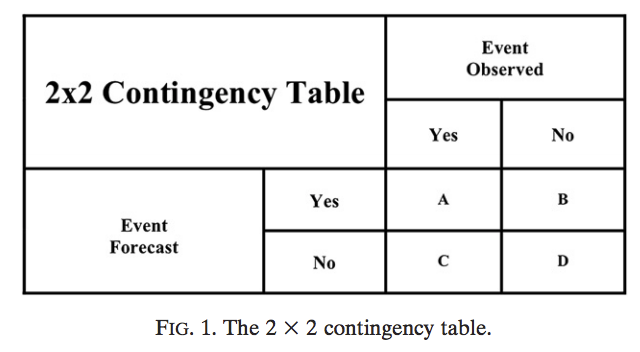 He then claims that a very systematic verification of forecasts will be extremely helpful in achieving quality forecasts, receiving fair feedback, and improving practices. Moving through the article, Roebber describes various methods of visuals that will help with overcoming the aforementioned barriers. He illustrates a 2×2 table of contingency that gives a dichotomous answer by cross referencing the event observed and the event forecast to see four responses. Additionally, he looks at “The geometric relationship between POD, FAR, CSI, and bias” by using evidence from Taylor (2001) which explains that the relationship between model performance-correlation, normalized root-mean-square difference, and variance; as well as providing the equations for model analysis. He states that while all of these models presented are great for comparison and analysis, it’s important to mention how vital it is to begin any calculations with adequate data.
He explains the common trend in the weather world that, bad data in results in bad data out. Included in the article is a diagram explaining how variance in values in POD, FAR, CSI, and bias move around on the chart. POD (Probability of Detection) falls on the Y-axis with Success Ratio on the X-axis. Furthermore, Roebber explains many challenging weather conditions for forecasters due to inconsistent data and the severe weather parameters in place that essential remove a great deal of automated aid in creating a forecast and puts a heavier pressure on raw analysis and data compilation via the forecaster. Finally, Roebber explains how despite having numerous models that seek to balance data in a respective way.
3 Things for More Research:
- A variety of forecasts (rain, snow, tornado, visibility, etc.) and how models will accurately place this in a way that won’t distort the confidence or probability of detection.
- Why more accuracy occurs in warmer seasons than in colder seasons – in relation to probability of detection.
- Study of verification procedure with watch box “hit” and “misses”.
Modern Meteorology:
Overall, this article seems to address how further studies can use better visuals when presenting the data that they’ve gathered in a way that is easily understandable as well as repeatable. Roebber looks to establish a calculation that takes into the forecaster bias that was previously hard to include along with verification and accuracy of findings due to the difference in objective vs. subjective data. By including three forms of looking at success of a forecast, the future of meteorological forecast analysis is looking to take new trials and may eventually find a way to overcome bias and technology based restrictions.
Thanks for reading everyone! Goodnight!


